

Timeline
March 2026 - May 2026
Role
Project Manager
User Researcher
Responsibilities
Interface with Client
Project Executing & Monitoring
Usability Research
Design Solutions Propose
Design Solution Mockup
Usability Report
Final Deliverable Lead
Disciplines
Social Science Research
Usability Research
User Experience Design
B2C Design
Social Network UX
Tools
Figma
Figjam
Google Doc
Private Panel
Methods
Competitor Analysis
User Interview
Persona
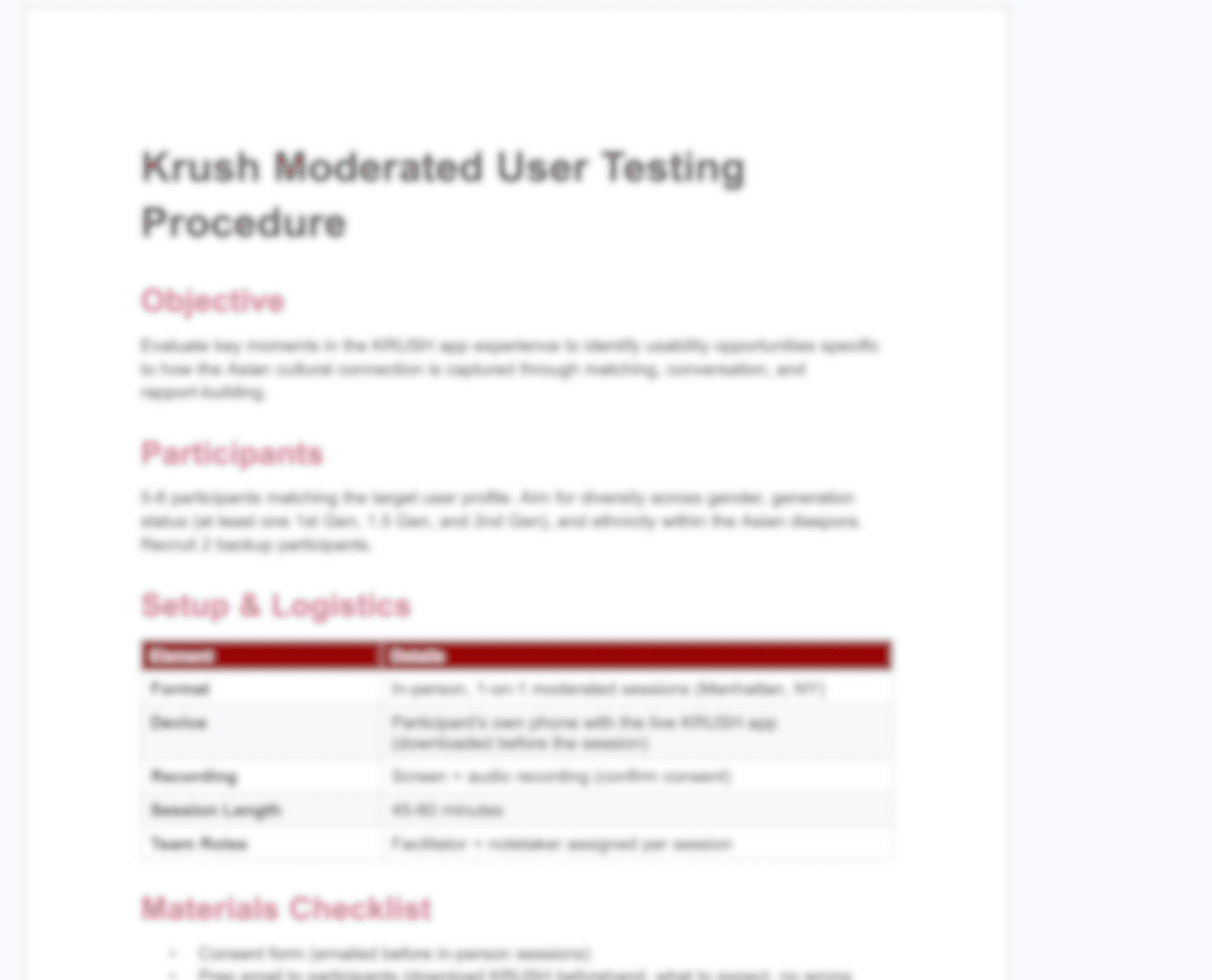
Moderate User Research
Usability Test
Prototyping
Teammate
Chloe Dahan
(Research & Strategy Lead)
Yu-Ting (Mandy) Chiang
(Content & Design Lead)
Advisor
Prof. Sam Raddatz
Associated with
KRUSH / Curelation, Co.
Center of Digital Experience
at Pratt Institute
Project Highlight
Overview
Turning Cultural Identity into Meaningful Connection
KRUSH is a dating and social community platform designed for global Asians and people who appreciate Asian culture. Unlike mainstream dating apps that treat identity as a filter, KRUSH positions cultural heritage as the foundation for meaningful connection.
Our challenge was to evaluate whether that promise was actually coming through in the live app experience with user research and usability testing.
Outcome Preview
From Cultural Promise to Actionable Product Strategy
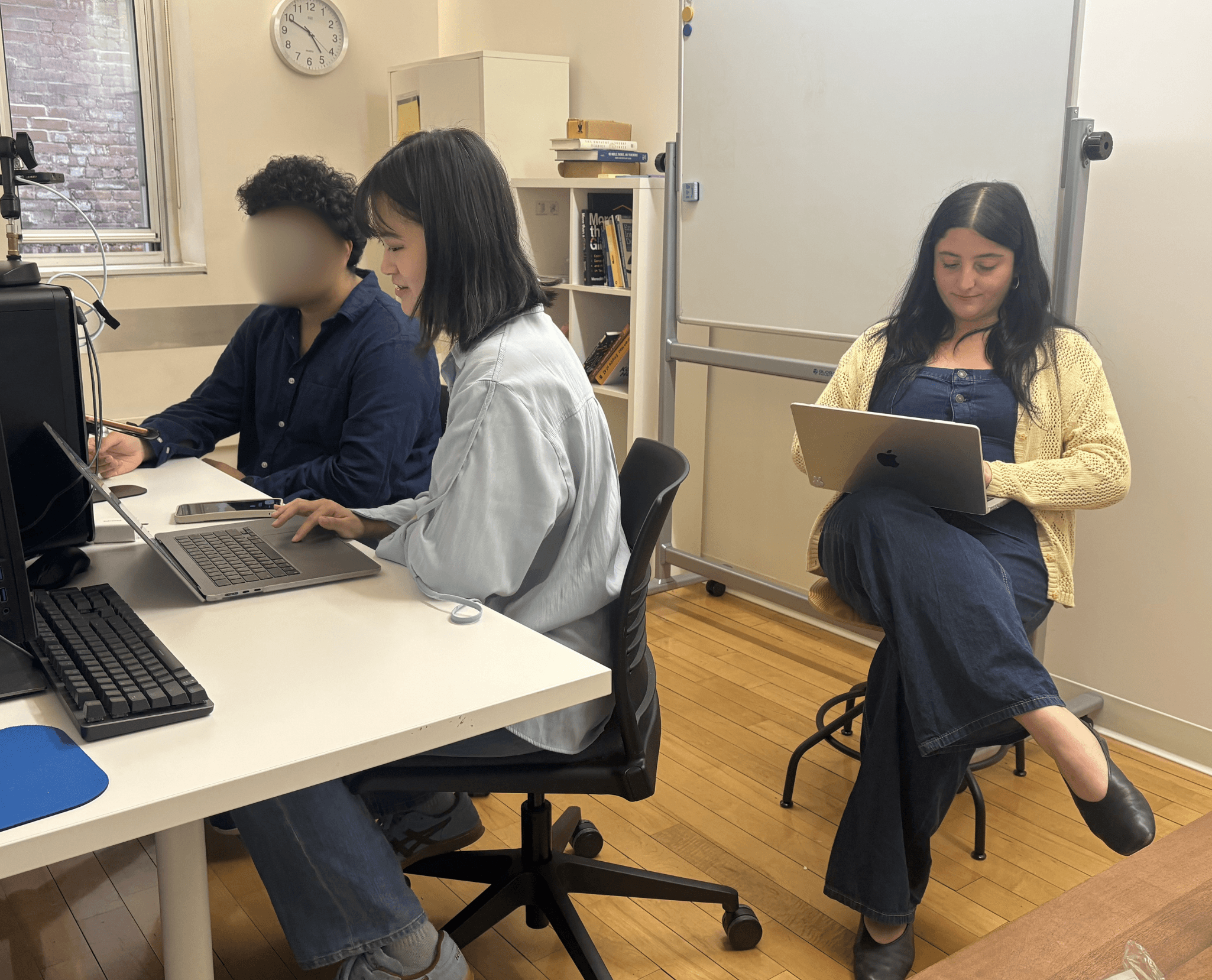
Through six moderated user testing sessions, we identified four product opportunities to help KRUSH make cultural connection easier to understand, express, and act on.

Clarify the Core Interaction System

Make Identity Labels More Meaningful

Support the First Conversation

Make Global Tab Easier to Understand
Together, these recommendations helped KRUSH see where its cultural promise was already landing, where users needed more support, and how the app could better turn shared context into meaningful connections.
Design Artifact
Turning Usability Research into Actionable Design
To make our research actionable, we translated the usability findings into two final deliverables: a detailed usability report and a set of visual design recommendations. The report documents our research process, participant insights, and prioritized findings, while the recommendation section shows how those insights could become concrete product improvements for KRUSH.

KRUSH Moderate Usability Report

Design Recommendations
What My Collaborators Say

Client
Stephen Moon
CEO of Curelation / KRUSH


Teammate
Yu-Ting (Mandy) Chang
UX Consultant @ DX Center

Teammate
Chloe Dahan
Product Design Intern @ MoMA
The True Story Behind this Project

The Case Study Author
Yung-Wei Chen
Something I wanna share before you dive into my research story…
Background & Why This Matters
Dating Apps Are Full of Matches, but Not Always Meaningful Ones
KRUSH’s mission is to reimagine the social experience for people who appreciate Asian culture, helping users build genuine relationships through dating, social events, and shared cultural experiences.
During the kickoff, the client shared that KRUSH serves Asian professionals globally, with users across the U.S., Canada, Europe, and APAC regions. The team also discussed current business and usability challenges, including premium features, monetization, unclear icons, onboarding confusion, and the need to improve matching quality.
" How might we support the KRUSH translate Asian cultural identity into product interactions that feel meaningful, inclusive, and actionable? "
The client’s goal was not just to receive basic app feedback. They wanted creative, product-relevant recommendations that could strengthen KRUSH’s matching experience and cultural positioning.
Research Process
From Client Questions to Tested Product Moments
Below section briefly cover the process from research to design in these three months:
01
The Kickoff: Aligning on What KRUSH Needed to Learn

02
Product Walkthrough & Competitive Audit: Understanding the Category

03
Methodology Design: Testing the Journey, Not Just the Screens
04
Pilot Testing: Fixing the Test Before Testing the Product

05
Moderated User Testing: Understanding Where Meaning Broke Down
06
Synthesis & Prioritization: From Observations to Recommendations

07
Design Deliverable: Sharing the Highlight Insights and Design Strategies with KRUSH

Participants
Users Who Reflected KRUSH’s Desired Audience

Overall Results
The Product Had a Strong Cultural Foundation, but the Users Needed Clearer Reasons to Trust, Understand, and Continue Using It.
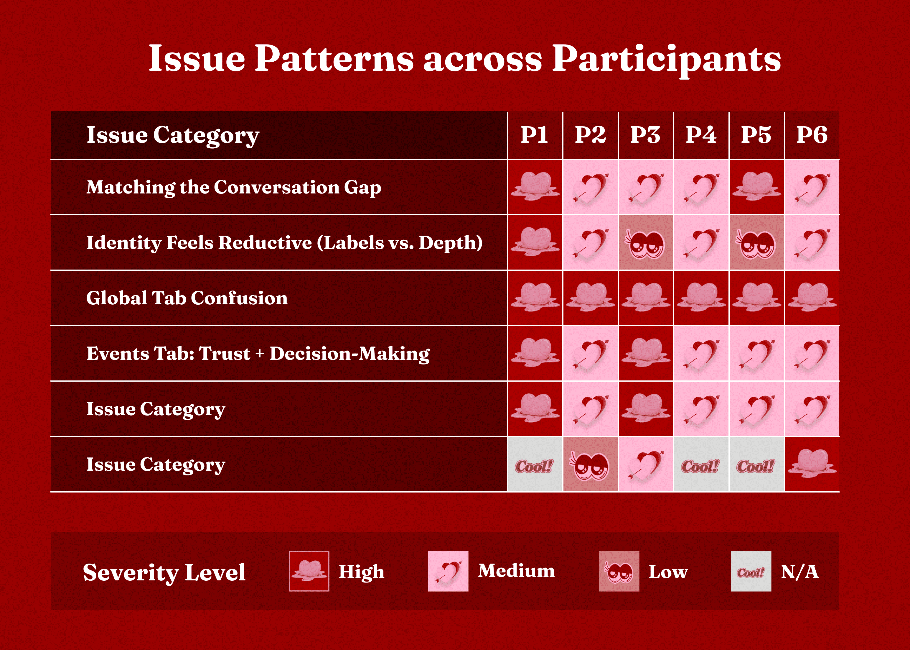
01
Events were KRUSH’s clearest differentiator

02
The app felt familiar, but not always distinct enough

03
Cultural identity was visible, but not deep enough yet

04
Several key interactions created hesitation
“What's the different between Heart, Like, and Spark?.”— P1, P2, P4, P6

Synthesis
KRUSH Was Not Lacked Cultural Identity, but Was Not Always Translated into Clear Interaction.

01 - Users needed the basic interface to feel clearer.
02 - Identity needed to feel more meaningful than static profile labels.
03 - Matches needed better support to become conversations.
04 - Global needed a clearer purpose and interaction so users could understand why it mattered.
Design Recommendations
Key Recommendation #1: Clarify the interaction language and reduce uncertainty across the app.

The Example of Where the UI friction Occurred.

Hearts are Currency

Likes are the Action
We’ll keep "Like" as the primary way to show interest in a profile.

Sparks are Visibility
Instead of just being a "stronger like," a Spark is now clearly labeled as a priority boost to help you stand out in a recipient's line.

Before - UI Friction
Key Recommendation #2: Make Identity Labels Meaningful
Participants appreciated that KRUSH asked about cultural background, language, and immigrant identity. But many felt these labels were not enough to communicate who someone was or what culture meant in a relationship.
The user interview found that cultural identity labels often felt reductive, especially when generation status, ethnicity, and language tags appeared as static profile information rather than as prompts for deeper connection.

The Example of Where the Identity Flatten Occurred.
Instead of only asking users to select identity categories, KRUSH could use profile prompts, add customized introduction sections, and matching signals that help users express how culture shapes their everyday life.

Before - Oversimplified Lifestyle


After - Create Deeper Understanding of Profile by Expand Lifestyle Labels, AI-Driven Assistant, and Assessments for Deeper Relationship Goals.
Moreover, since five out of six participants prioritize finding matches with similar backgrounds, interests, or values, we suggest using colors to highlight shared points and displaying a similarity percentage at the top of the profile to help users quickly find common ground.


Before - General Profile


Before - Highlight Commonalities on Profiles
Key Recommendation #3: Support the Scaffolding of Conversation
The match-to-conversation moment was one of the biggest experience gaps.
Participants could browse and match, but once they reached the message screen, the app gave them little support for what to say next. For a product built around meaningful connection, this moment is critical.
To solve the "blank screen" problem, we’re proposing three layers of support to help users move from a match to a real-world date or deeper conversation.

Layer 1: Culturally-Grounded Openers (aka. The "What to Say")
Introducing "Dynamic Icebreakers.'" Instead of generic prompts, the app surfaces bridges based on shared identity.

Layer 2: The Date-Planning Aid (aka. The "Where to Go")
Instead of dropping users back into the swipe stack, we show a summary of their shared interests.
For instance, if the system sees you both love Thai food and quiet parks, it might suggest: "Why not grab dinner and take a walk through the local park?" This turns a digital match into a concrete plan immediately.

Layer 3: Commitment Signals (aka. The "Trust Factor")
We’re adding "Commitment Badges" to satisfy the needs of high-intent users.
By surfacing signals like "Profile 100% Complete" or "You Both Seeking: Long-term," we give users the confidence that the person they are messaging is just as invested in a sincere connection as they are.
Together, all these features turn the first message from a moment of anxiety into a moment of intentional momentum.

Before - Lack of scaffolding in Conversation.


Key Recommendation #4: Fix the Interaction Understanding Gap of Global
Global was one of KRUSH’s most intriguing features, but also the most confusing.
Participants were not sure whether Global was for long-distance dating, international discovery, travel, diaspora connection, or system-recommended matches. Because the purpose and navigation were unclear, users could not confidently decide how to use it.
Our recommendation focused on making Global easier to understand without adding more complexity.

Layer 1: Explain Global upfront
Added a clear tagline, “Find your person, anywhere”, to frame the feature immediately. We also replaced the unclear country pairing with a simple Worldwide / My Country toggle, so users know what type of discovery they are choosing.

Layer 2: Make filters visible and trustworthy
Instead of telling users their preferences will apply “in the next batch,” the redesign shows active filter chips, such as Canada and Japan, plus a live result count: “24 people match, updated just now.”
This helps users see that their filters are working.

Layer 3: Carry Global context into profiles and chats
When a match comes from Global, the app should keep that context visible. A small Global icon and line like “You connected with Irene on Global” helps users remember why the conversation exists.
On the profile view, shared context such as “Currently in Canada, from Beijing” or “You both speak Mandarin” gives users a clearer reason to connect.

Before - Unclear interaction and Navigation of Global.


Reflection & Lessons Learned
Designing for Culture Means Listening Beyond the Usability and Interface
This project was not a classic usability test. Because KRUSH is built around Asian dating, social connection, and cultural identity, we had to look beyond whether users could complete a task, which taught me that designing for culture requires more than adding identity labels or cultural references. It requires understanding how people express belonging, evaluate trust, start conversations, and decide whether a space feels meaningful enough to join.
For KRUSH, the opportunity is not only to help users find more matches, but to help them recognize shared context and turn that recognition into a real connection.
Moreover, moderating usability sessions about dating, culture, and identity required extra care. I learned how to ask neutral follow-up questions, avoid leading participants, and give people time to think.
I also became more comfortable with silence. Instead of rushing to fill the pause, I learned to wait and let participants process their thoughts. Many of the most valuable insights came after those quiet moments.
The Future
From Classroom Research to Live Product Iteration
KRUSH has reviewed our findings and shared them with their internal team as they prepare to continue iterating on the app. It was exciting to see our research become useful beyond the classroom and potentially inform a live product experience.
In the future, if I continued this project, I would next focus on testing the areas we could not fully explore within the semester's scope, especially Events. Participants saw Events as one of KRUSH’s most unique features, but they still needed clearer event details, trust signals, attendee expectations, and cultural programming before feeling comfortable joining.
I would also prototype and test the key recommendations: clearer Global onboarding, culturally aware conversation starters, more meaningful identity prompts, and stronger Event pages.


